pridemobility figma
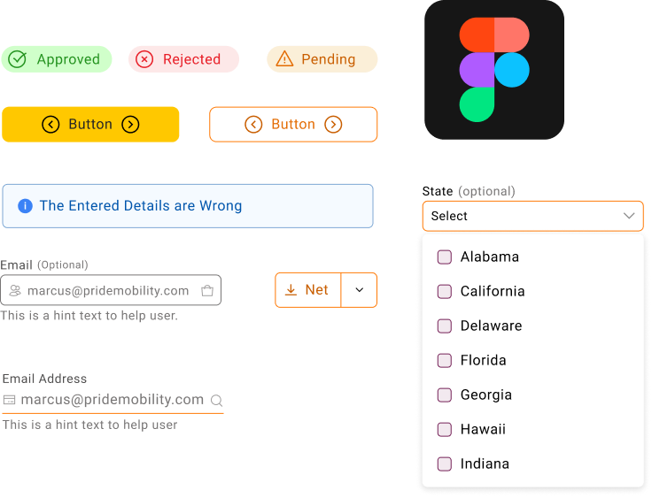
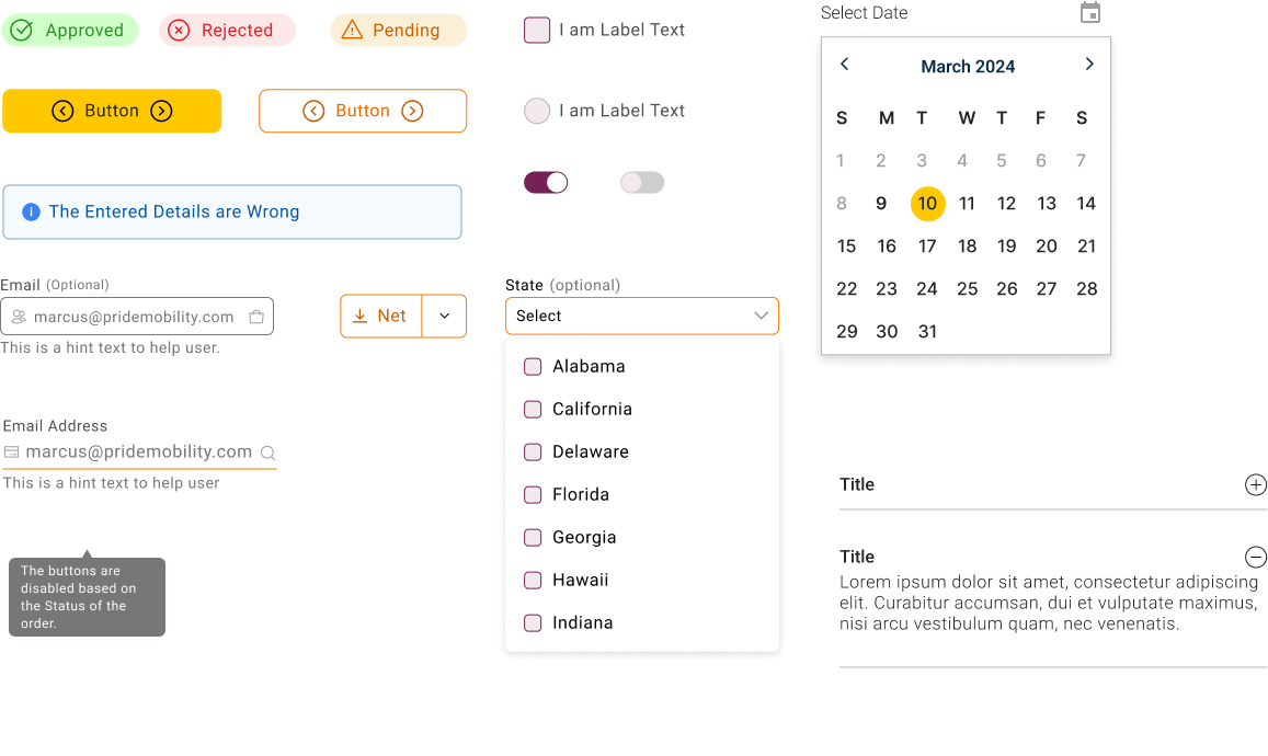
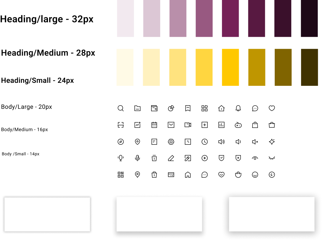
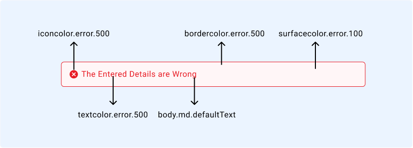
design system
Project Duration: 5 months
Designing the Foundation Behind Pride Mobility’s Digital Experience
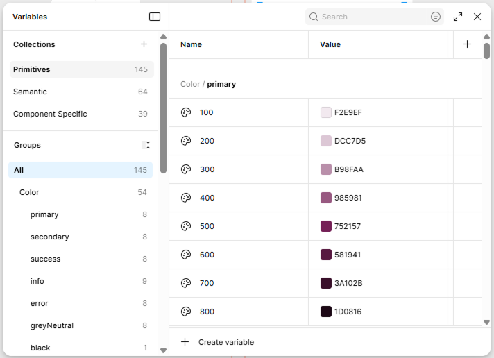
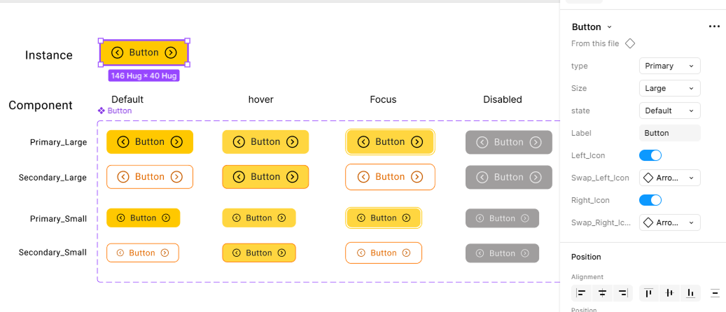
A scalable, accessible, and production-ready design system built in Figma to unify product, accelerate development, and create consistency across complex B2B and e-commerce experiences.