redesigning B2B E-commerce for authorized providers & retailers
Project Duration: 1.5 yrs (ongoing)
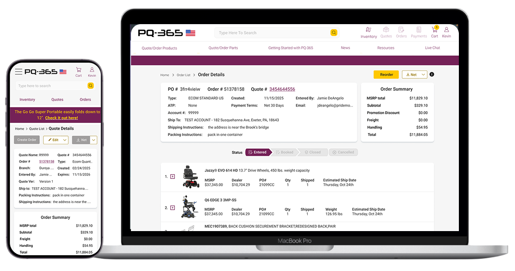
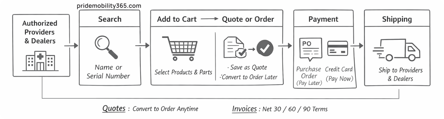
400 mobility dealers and providers across the U.S. and Canada were losing time to broken workflows — wrong parts, repeated steps, and checkout errors that only showed up at the end.
This is how we redesigned PrideMobility 365 to fix it.